Thursday, 13 December 2018

Mark Making

Our ability to draw depends on perceptual accuracy, visual memory and the necessary elements we select to draw.  This can significantly improve with practice.

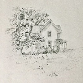
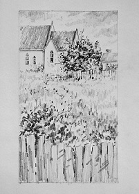
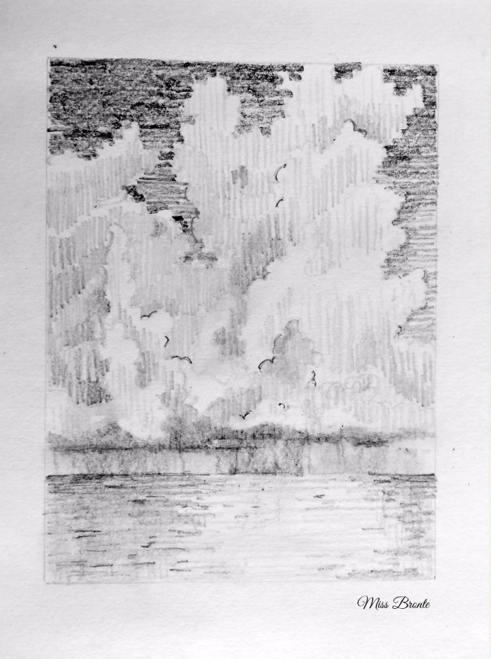
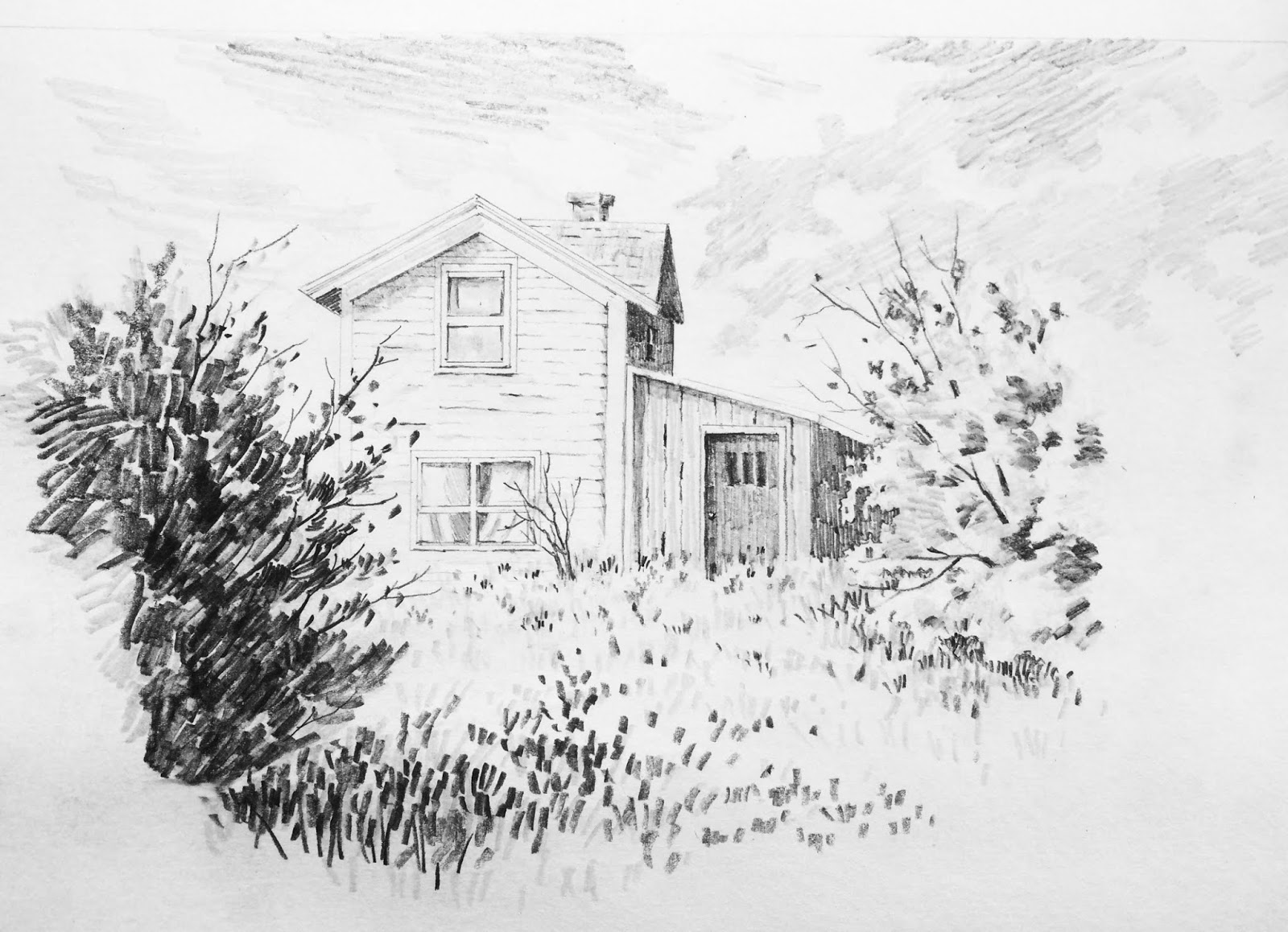
During the beginning stages of our artistic journey, the aim for realism seems to be a priority.  At some point however, after a level of mastery over the basic skills of realistic rendering is achieved, we need to take risks and create something unique that becomes our artistic style.  "Mark making" is one of the contributing elements of artistic style.  Marks add expression to our art work.  Our style is the result of our skills, absorption of information and influence of artists whose work we love.  This means it can change as we continue to grow as artists.   In order to build our skills, we immerse ourselves in the works of artists whose creations we admire.  However, practicing is not the end.  The process of growth never ends.


my oil painting after C. Klein

"The artist sees what others only catch a glimpse of."
-Leonardo Da Vinci

Saturday, 10 November 2018

Sketching Seabirds

This fall morning, as I was adjusting the blinds to let in more light, I noticed outside, my few pots of kale, mint and chives were still green but definitely in need of some sunshine.  The sky was blanketed with yesterday's grey clouds.  It reminded me of the colour Payne's grey which is often my go to colour when I want to do a value study.
 And so, I completed this little painting. : )


Many view seagulls as noisy little scavengers.  I on the other hand, find them beautiful and free.  There is a great deal of diversity between them.  About 44% of world's gull species are found here in Ontario Canada.  Furthermore, for artists they are simple and a lot of fun to sketch and paint.  :)

Here are some of my recent sketches.


I used about 5 values including the white of the paper.


The last several days have been calm and enjoyable thanks to the beautiful seagulls!  I hope you too will have the opportunity to express yourself and nurture your soul.  


Wednesday, 31 October 2018

Gratitude


acrylic impasto painting sold


''Let us be grateful to the people who make us happy; they are the charming gardeners who make our souls bloom. " 
- Marcel Proust 

Tuesday, 28 February 2017

Feeling a Little Rusty

The unpredictable and flowing cloud shapes are always great warm up subjects.

To start, dedicate a portion of your paper to the sky and lightly draw the outline of your cloud shapes. Then using your various pencil tones, create your values.


It can have a simple landscape ground, a body of water or you may add other elements such as trees.


Here is an old cottage. A little drawing tip to share with you here, is placing your darks and lights in a way that is more interesting and perhaps pleasing to the eye. For instance, the top tree branch over the little window has a light value just as it crosses the dark window, and it changes to a dark value as it goes over the light tone of the house!
Also, if you are drawing an old building, allowing some of the architectural lines to be uneven, helps portray its rustic character, such as the small wooden steps leading to the porch.


Lastly is a somewhat “neat” sketch. :)


“Every artist dips his brush in his own soul and paints his own nature into his pictures.”
-Henry Ward Beecher

Monday, 8 August 2016

Summer Landscapes

I always look forward to the summer months.  Colorful flowers, singing birds and luscious green trees are seen everywhere even if you live in the city, as I do.  It is a perfect time to be outdoors finding interesting scenes to sketch.

However, I have not been sketching as much as I would have liked to.  Besides being busy with life's usual ups and downs, I have just been enjoying the silence of long sunny summer days reading, cooking and going for walks.

I hope I will be back to my drawing and painting mood as the weather becomes cooler. For the moment, I have a few pencil sketches to share with you.
Wish you all a wonderful summer!


"Rest is not idleness, and to lie sometimes on the grass under trees on a summer's day, listening to the murmur of the water, or watching the clouds float across the sky, is by no means a waste of time."
-John Lubbock

Wednesday, 27 January 2016

Figures in Watercolor

Drawing and painting figures are still on my to do list these days.  I enjoy working with pencils but I miss watercolors too. So, I gave myself a break the other day and decided to explore other media to work on the figures.
Here are three figures in watercolor.  I began with a simple pencil outline drawing.  I then started to paint with watercolors working from light to dark.


A closer look indicates the wet-into-wet mixes.  Allowing the different parts to connect, makes the clothing look more natural and fluid. Once those first washes were dry, I added more layers on top in some areas to create the shadow patterns and the folds.


In my toned paper sketchbook, I drew more body shapes and used pen to render the shadows.  The white charcoal pencil is fun to use for highlights.  In the background, I added some light and dark hatches to oppose the tones of the figures (light against dark, dark against light)! 


Painting clothed figures in watercolor is a great way to practice your wet into wet technique; to learn to control the amount of water and to find beautiful color mixes. 
Take your time with your drawing, plan your color scheme and prepare your washes before you start painting.  There are many photos of people online to use as your reference. 

Whatever you are working on, enjoy! :)

Saturday, 16 January 2016

Figure Drawing Continued ...

I have been waiting for the sun to appear in order to have better lighting indoors, so that I could take a few photos of my drawing for this post.  Thus, it took me several days to take photos of the different stages of shading and finally complete the drawing.
I was becoming impatient but returning to my drawing provided me with a fresh eye and the opportunity to readjust if needed.  
I used my regular HB pencil to begin the contour drawing.  


The next stage was applying a layer of tone with my lightest pencil 4H, using diagonal lines and stopping the lines just at the space where a highlight supposed to be.  As you can see, even a simple layer of tone makes an impact.  I did end up finishing the shading of the head at the start.  For no particular reason. :)


Next, I used my 2B pencil to go over the areas in shadow.  Again I applied diagonal lines in the same direction (mostly) as before.  Also, adding the shadows on the floor helped keep the figure grounded.


The last stage was using my darkest pencil 6B to add another layer of dark only where needed.  For the background and the fabric, I added a minimal amount of shading to push them back and maintain the figure as the main area of interest.  
It is my preference to use lines for my tones.  Some use even tones such as blending.  I don't really like the look of "smudging".  But again, there is nothing wrong with it.  


I hope you find this post helpful.  Remember to keep it simple and enjoy the process!